
pokeberry123
Member
Ever since v4 was released, my least favorite thing about the OTv4 menu has been the ugly light-theme checkboxes.
Onetap had nice checkboxes in v1, v2, and v3, so I assumed it was temporary.
However, many months later, here we are, still stuck with these shitty checkboxes that look like they are from a 90s default HTML page.
The checkbox rendering isn't even animated so it's probably like 4 lines of code, just please fix it, everyone I've asked agrees they are ugly and/or don't fit the theme of the menu.
I went into MS Paint and made them 10x better in 15 seconds.
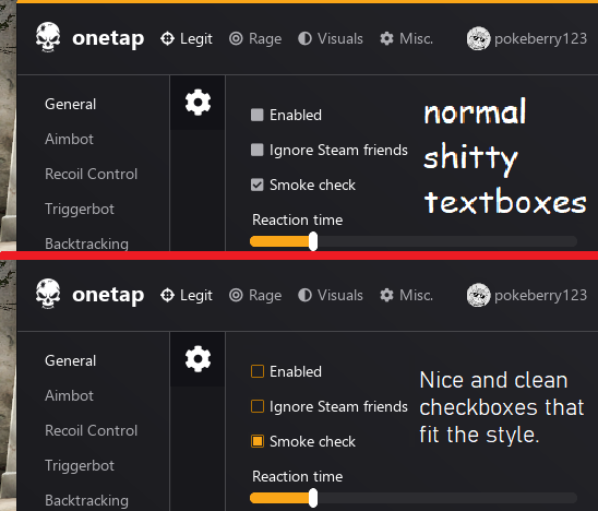
Please fix the checkboxes. Thanks!
Onetap had nice checkboxes in v1, v2, and v3, so I assumed it was temporary.
However, many months later, here we are, still stuck with these shitty checkboxes that look like they are from a 90s default HTML page.
The checkbox rendering isn't even animated so it's probably like 4 lines of code, just please fix it, everyone I've asked agrees they are ugly and/or don't fit the theme of the menu.
I went into MS Paint and made them 10x better in 15 seconds.
Please fix the checkboxes. Thanks!
